
Nepal Food Foundation is a non-profit sharing organization that aims to contribute creatively to a broad dialogue on the future of food systems in Nepal. It is absolutely clear, be it to achieve the Sustainable Development Goals (SDGs) or to tackle the crisis such as COVID-19, that the food systems need to be resilient and sustainable.
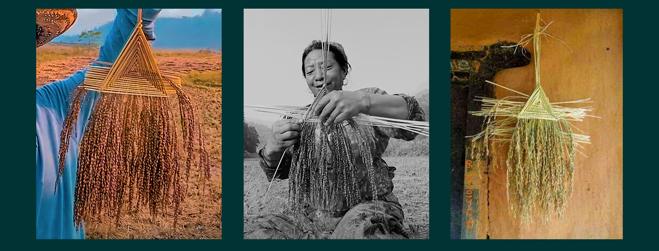
Pictures shown above are the physical example of Paddy interwoven butterfly from where the logo was derived. It’s no wonder that rice is an important part of Nepal’s rituals, ceremonies and festivals. The grains are embedded in the circle of life, much like the “Dhan Ko Putali” (Butterfly of Paddy) which is a bunch of paddy straw interwoven with grains. Before starting harvesting, we pray and worship in the form of “Putali” which is hung within the home, symbolizing the protection of the seed in case of starvation or scarcity. The logo evokes the idea of “Putali” which is presented in a clean and modern minimal style. The logo looks unique and catchy but also carries the authenticity. Also being strongly associated with nature and culture, the logo depicts the landscape of Nepal, the Himalayas, the mountains and the Terai.
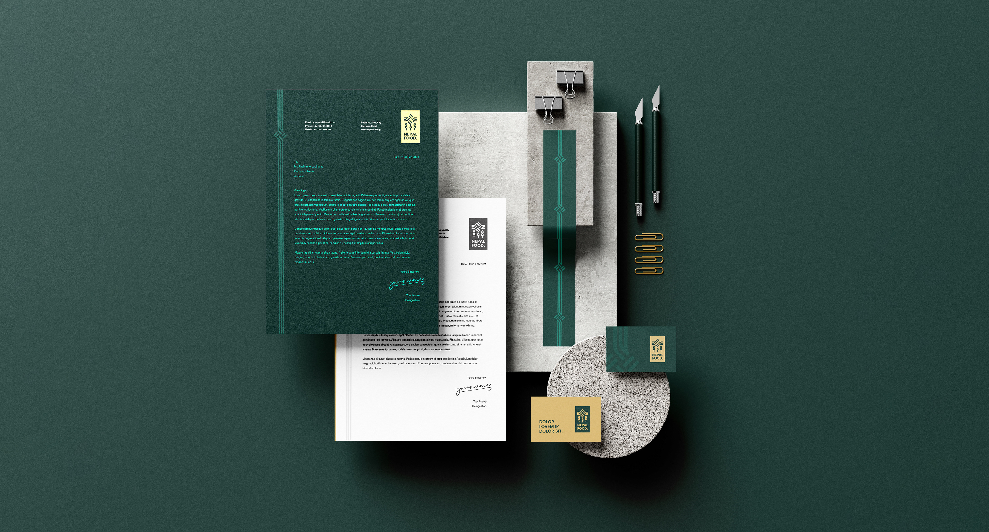
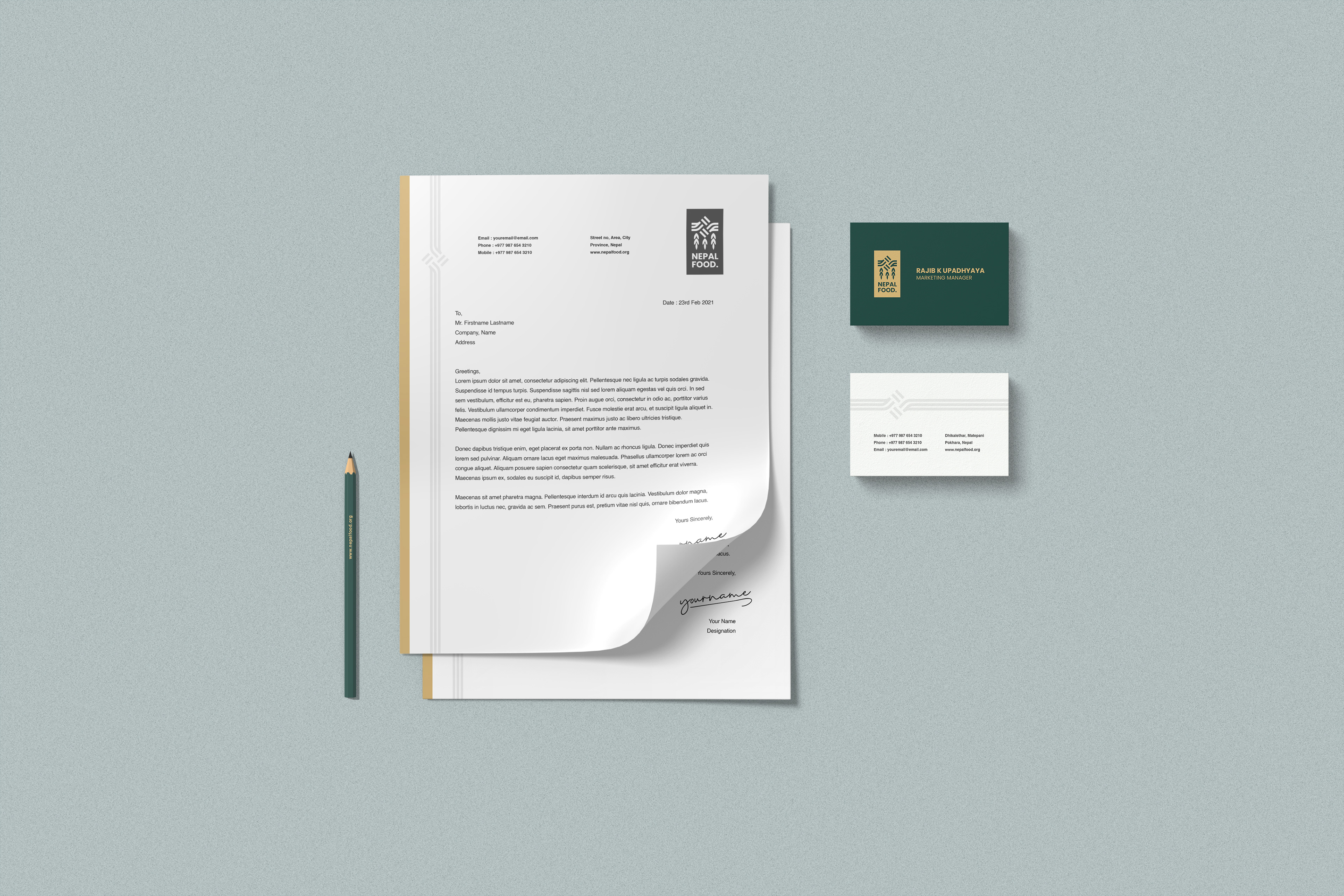
Logo Applications
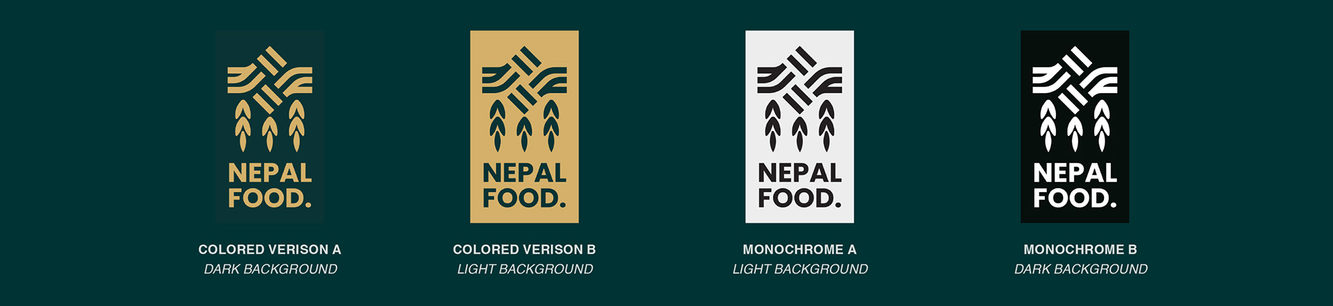
The examples of the logo applications are shown below. The logo can be applied as the given samples only and the font on the logo should not be typed using any other fonts. The logo is more into the emblem not much into the icon based logo thus there is no way of breaking the logo icon and the font.

Project : Nepal Food Network Logo
Direction & Design: Sandeep Tiwari
Client: Nepal Food Network
www.clinchadvertising.com
Direction & Design: Sandeep Tiwari
Client: Nepal Food Network
www.clinchadvertising.com